THE DIGITAL IMAGE
(updated 01.29.21)
Rather than mythically setting up humans’ relationship to the image - which I would most certainly do an underwhelming job of - let’s start with the assumption that you generally know what an image is.
Take a moment to ask yourself, though:
What makes an image an image?
What defines it as such?
What traits make up any given image?

The Matrix Reloaded. 2003.
Let’s take the risk of consulting an actual definition of the word. The most appropriate definition given by Merriam-Webster reads:
A visual representation of something, such as:
1. a likeness of an object produced on a photographic material
2. a picture produced on an electronic display (such as a television or computer screen)
This narrows the overall idea down, almost too much, but certainly fits within the context of how we are approaching the term.
So, in keeping the above in mind:
WHAT TRAITS AND PROPERTIES DEFINE AN IMAGE?
.
.
.
SUBJECT
The subject is the focal point of an image. As such, the subject should (usually) be readily identifiable to the viewer.
We can use composition, focus, brightness, color, contrast, and more to help draw the viewers’ eye to our subject in the frame.

Blade Runner 2049. 2017.
Once there, the tone of the image is heavily influenced by our subject’s action (or inaction), position, and expression, if applicable.
Not all images have a clear subject, however. An image of a repeating pattern doesn’t have any one area in which the viewers’ eyes are drawn. The entire purpose behind the well-known ‘Where’s Waldo’ books is the task of finding the subject in the frame, which is intentionally difficult.
Likewise, landscape images are meant to be explored by the viewers’ eyes. MC Escher was an artist who was known for creating mind-bending fictitious landscapes, which rarely featured a strong singular subject that drew the eye. Instead, the viewer is encouraged to stare long and hard at the art to explore all of the impossible details.

MC Escher’s Waterfall (https://www.mcescher.com/gallery/recognition-success/waterfall/)
SETTING (BACKGROUND AND FOREGROUND)
The setting is the environment around our subject. Setting greatly affects the way that the viewer perceives the subject, and the image overall.
If we want to minimize the setting to force the viewer to focus on the subject, we could place the subject in front of a flat background, place them in a dark room, shoot them with very shallow depth-of-field, or some combination of these. This is arguably wasting part of the image, however, and ideally should be done with purpose and reasoning.
Generally speaking, we should try to make as much use of our background as possible. Perhaps you use the light and color of your background to complement the theme or tone of your subject. Perhaps you use leading lines to guide your viewers’ eyes. Perhaps you just fill it with snakes because that’s what our hero hates the most.

Raiders of the Lost Ark. 1981.
Another thing to consider in regards to setting: Is it expected, given your subject?
For instance, if your subject is a businessman, it would be expected for him to be in an office setting. But what if he were in a jungle? Or the middle of an endless desert? If we’re trying to create striking visuals, this type of juxtaposition can certainly do the trick. And maybe it’s this type of image that you start to build your narrative from, and construct your story around.
COMPOSITION
Composition can mean a couple of things in regards to an image.
It might be how your subject is positioned within the confines of the frame (the literal edges of your image). It’s this type of composition that we’ve created rules for ourselves, like the rule-of-thirds, etc.
It can also be in reference to how your subject is positioned in relation to the setting or other subjects. Now we aren’t only concerned about where we put the subject relative to the frame edges, but also how we frame the setting, and create balance between multiple subjects.

Kill Bill, Vol. 2. 2004.
Within the frame, is your subject center-framed, on one of the ‘points of interest’ of the rule-of-thirds, along the edge of the frame, or somewhere else?
In relation to the setting and other subjects, how large is your subject? Are they larger or smaller than other subjects? Does your setting help to draw the eye to your subject, using leading lines or other compositional tools? Do the colors of the setting help set the mood and tone of the scene?
PERSPECTIVE
Perspective is the point-of-view of the camera, and by extension the viewer. Changing the perspective changes the relationship of the subject to the surroundings and other subjects, but also can affect the way that the subject is perceived.
Are we near the subject or far away?
What do we see behind them (or even in front of them)?
Are we looking straight at the subject?
Looking up or down at the subject can subconsciously send very different messages to our viewers. Looking up at the subject empowers them, whereas looking down at them can make them seem compromised or weak. These correlations are ingrained in us from childhood, when we would have to look up at all the adults who had power over us.
Sometimes, however, the direction of the camera is simply to give us the most informative perspective. Perhaps it gives us a better understanding of the physical space, and the relation between characters or objects in the scene.

Aliens. 1986.

Pacific Rim. 2013.
What sort of field-of-view are we seeing the image through? In other words, are we using a wide angle lens, standard lens, or telephoto? This drastically affects how an image feels.
Wide angles can make nearby things look larger than life (even if they’re not) by making close subjects appear much larger than distant ones.
Telephoto lenses are better for making features look more flattering, and to emphasize focus across physical distance.
FOCUS
Focus, in this context, is the alignment of optical elements in a lens to control the focal plane. The focal plane is a field along the z-axis in which details are rendered. Anything within that focal plane is considered to be ‘in focus’. Most people then refer to the focal plane’s location as ‘focus’. Like every other aspect of the image, focus is a creative choice.
Where is the focus?
Is the focus perfectly on our subject’s eye?
Is the focus on an item that our subject is looking at or focused on?
If the focus isn’t on the implied subject, then the image would be considered ‘out of focus’ by most accounts. Having your subject out of focus can, like most (all?) things, be an aesthetic or artistic choice, but don’t let this fact become an excuse for a technical mistake.
Another consideration regarding focus: how deep is our depth-of-field?
Depth-of-field is the term for how wide, or deep, our focal plane is. It’s determined mostly by the aperture and focal length of a lens.
A deep depth-of-field allows many things to be in focus, which can help in creating a ‘dense’ frame with plenty of subject and setting for our viewers to explore.
A shallow depth-of-field, with a thin focal plane, limits our focus to a specific subject, and can create a pleasing visual effect, such as the lovely bokeh on display in this shot of Agatha from The Grand Budapest Hotel (2014).

The Grand Budapest Hotel. 2014.
SHAPE OF The FRAME
Is your image a rectangle? Square? Circle? Perhaps it’s in the shape of a spoon?
The shape of the frame isn’t something we think about too much in the digital age - except when designing logos to fit within a square or a circle - but the shape of the frame undeniably shapes the way that we perceive the image.
ORIENTATION
Is your image situated in a landscape or portrait orientation?
Landscape images are oriented horizontally, meaning they are wider than they are tall. When taking pictures of landscapes, which are at or near the horizon, the subject matter will almost certainly be situated more along the x-axis.
Portrait images are oriented vertically, meaning they are taller than they are wide. The term ‘portrait’ implies person, and people stand vertically upright, and thus are taller than they are wide.
Today’s digital landscape makes choosing an orientation difficult. Our phones are used primarily in portrait orientation. Desktop computers and televisions, however, are used in landscape orientation. Images that have a square aspect ratio, meaning they are exactly as wide as they are tall, are equally suited to both portrait- and landscape-oriented devices, but this is a bit of a compromise, as you never utilize the full extent of either screen type.
SIZE and detail
Depending on the format, there are a few different considerations here.
In a physical, analog piece: How large is it, physically? Does it fit in your hands, or does it take up an entire wall (or ceiling)? The same fundamental image, displayed in these two different contexts, makes for very different viewing experiences.
![Michelangelo’s Sistine Chapel Ceiling (Sistine Chapel [CC BY 2.5 (https://creativecommons.org/licenses/by/2.5)])](https://images.squarespace-cdn.com/content/v1/55a3fd98e4b08799f6f08154/1567176320380-NQ2BOLJLKDBJ4Y1WRJY6/sistinechapelceiling_michelangelo.jpg)
Michelangelo’s Sistine Chapel Ceiling (Sistine Chapel [CC BY 2.5 (https://creativecommons.org/licenses/by/2.5)])

Leonardo DaVinci’s Mona Lisa
In a digital image, there are similar, but different considerations to size:
What is the resolution of the image? (More on this elsewhere.)
What is the size of the screen you’re viewing the image on?
From what distance are you viewing the image?
Past a certain point, excessive resolution makes no difference to the viewing experience of most things, but it all depends on the setup. Viewed on a smart phone at normal distance, there’s no substantial difference viewing anything over 1080p. But if you are close to a screen that is 100 feet wide, then you’ll notice much higher increases in resolution.
Likewise, how much detail is there? This question relates to both physical and digital media.
Fine detail, if meant to be experienced as part of the total image, is something that is more suited for larger physical sizes, higher resolutions, and closer viewing distances.
If the physical medium is small and/or if the display isn’t of sufficient resolution or size, then detail won’t be a substantial part in the experience of the image. This leads to interesting quandaries in an age where most people consume images on their relatively small, portrait-oriented smartphones.
BRIGHTNESS
Is the image bright, neutral, or dark? This naturally has a significant impact in how the viewer will interpret the subject and meaning of the image, especially if expectations are subverted.
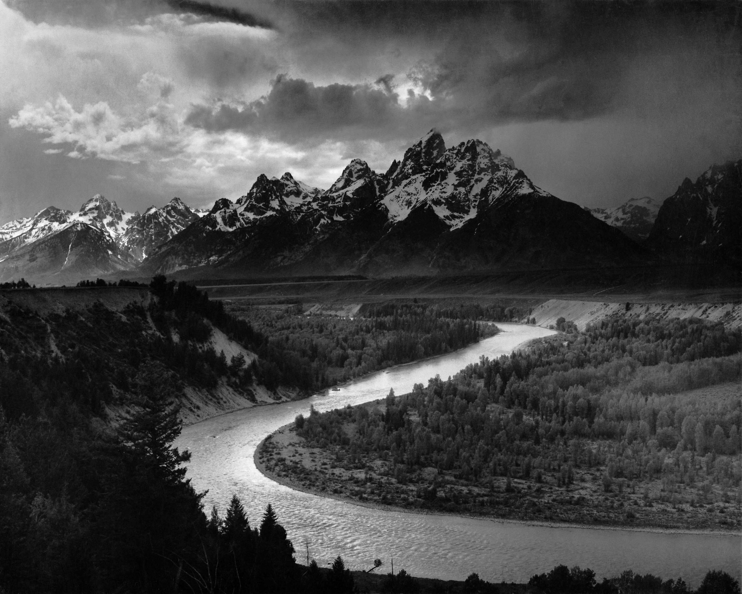
Ansel Adams’ The Tetons and the Snake River

Se7en. 1995.
CONTRAST
Contrast has become a bit of a trope when it comes to motion pictures and photography.
High contrast, with its bright highlights and/or deep shadows, is seen as dramatic and/or action-oriented. The shadows are especially suited to the horror genre.

Shaun of the Dead. 2004.
Low contrast is more commonplace in comedy, romance, or independent features. Most of these genres tend to be more based in reality, and the contrast levels are arguably more lifelike.
COLOR
Are there colors that stand out in the image? How might they impact the way that the viewer forms thoughts and feelings about the image? There is a lot of cultural association to a lot of colors, but especially the primary (red, blue, and yellow) and secondary colors (green, purple, and orange).
Is the overall image warm or cool?
A warm image, featuring reds, oranges, yellows, or violet, will often feel inviting or positive. A cold image, featuring primarily blues, purples, and greyscale, can be alienating or depressing. Where do these associations come from?
Is there a tint of another color? Why was that color chosen? What might that color mean?
What level of saturation are the colors? Is there selective saturation? What might it mean to leave some colors and not others?
Is there a unique color grade? What does this grade say about the piece? Does it relate to anything else via association? Does it reinforce or subvert tropes and expectations?
Finally, good set design often features well thought-out use of color. Wes Anderson is an auteur who is known for the meticulous set design in his films, which prominently feature carefully curated color palettes.

The Grand Budapest Hotel. 2014.
How else is color used in the frame? What color are clothes? Items? Walls? Floors?
THE DIGITAL IMAGE
So far, we’ve listed some of the properties that might be used to describe any given image, from a painting to a motion picture and anything in between.
But what is an image really made up of?
It’s easy enough to answer this question for most physical mediums. Canvas. Oils. Graphite. Etc. But most images that we see are digital, so what then?
what are the elements of a digital image?

Super Mario Bros. 3. 1990.
THE PIXEL
The smallest measurable element of a digital image is the pixel.
Pixels are somewhat abstract in that they are essentially shapes of color. Theoretically, a pixel could be any shape, but realistically it wouldn’t make much sense for a pixel to be anything radically different than a quadrilateral.
And that’s why, practically, pixels have always been four-sided shapes; rectangles and squares. The pixels themselves line up in perfect rows, and stack perfectly on top of each other; theoretically leaving no space between them. (But like all things digital, they are really just made of ones and zeroes.)
Fundamentally, a pixel is defined by two simple things: color and shape, which is its pixel aspect ratio.
COLOR
Digital color, to this point, has long been defined in a number of somewhat redundant methods; the most common of which are arguably HSL and RGB.
HSL stands for Hue, Saturation, and Lightness. Hue defines what color the pixels are. Saturation defines how much of that color there is, with zero saturation being somewhere along the greyscale. Lightness defines that color’s proximity to black.

RGB stands for Red, Green, and Blue. Red, green, and blue are the ‘additive’ colors. That means that these three colors together, in the form of light, will create white or grey. That is, if the three colors are in equal measure. Shift the balance of these three colors, though, and you are able to make any other color.
Similar to the concept of meters and feet, HSL and RGB are simply two different ways of conveying the same value. You can define any color within the visible color spectrum with either HSL or RGB.
PIXEL ASPECT RATIO
Pixels are, once again, quadrilaterals. The pixel aspect ratio, then, is just the property that defines the width:height ratio of the pixel information used to create the image.
For various reasons, it used to be common for video to have non-square pixels. The most practical reason for this is efficiency. To fill a 16:9 Full HD display, you need 1920x1080 pixels with a square aspect ratio (1:1). But by using rectangular pixels with a pixel aspect ratio of 4:3 (1.333), creators could fill the 16:9 image area with only 1440x1080’s worth of pixels; only 75% as many. These files were almost always displayed on screens that had square pixels, however, and the pixels on the screen would usually reflect whichever the dominant pixel was on any given space, or a blend of two pixels.
If that’s confusing to you, then I’ve got some good news: pixels are just square now. Meaning that the pixel aspect ratio of almost all photo and video is 1:1, which is also written like (1.0). The days of needing to use non-square pixels for the sake of efficiency have passed. Lucky us.
Keep in mind, too, that so far we’ve been talking mostly about the pixel aspect ratio of the images themselves. All modern displays, such as televisions, computer screens, phones, tablets, etc, display using square pixels.
An image pixel and a display pixel aren’t exactly the same thing, but operate in practically the same fashion. After all, an image pixel is more or less theoretical until it’s displayed on a screen, at which point it’s actually represented by a display pixel.
RESOLUTION
Compared to things like pixel aspect ratio, resolution is fairly simple and straightforward concept. Resolution is simply how many pixels there are across one row of the x-axis by how many pixels there are across one column of the y-axis. In other words, resolution is the width of the image, in pixels, by the height of the image, in pixels.
In some use cases, resolution might not measure the full pixel width and height of something, but rather the pixel density of a canvas or image. You’ll see this in Photoshop and other similar software. The reason for this is to make sure that you’re working with a sufficient pixel density for displaying at a certain size. In this case, the size of the canvas (in inches, centimeters, etc) matters, too. Common pixel densities are 72 pixels/inch (for standard print and most physical exhibitions) and 300 pixels/inch (for display on modern high-resolution screens).
While the concept is relatively simple, there are a lot of various resolutions that we run into in our daily lives. Here are some of the current resolution standards of digital video, and where you might find them:
1280x720 (16:9) - This is the original ‘HD’ (‘High Definition’). Many cable channels in the US are still broadcasting in 720p. Also, Twitter and Facebook videos. How is it that so many people are fine watching 720p videos on their high-resolution, handheld screens?
1920x1080 (16:9) - Full HD (FHD). This is how the bulk of video is seen by most consumers. Netflix, YouTube, Hulu, etc. Also, Blu-Rays!
2048x1080 (17:9) - DCI 2K. Digital Cinema Initiatives standard for 2K theater display. Standard theater showings are some variation of this standard.
2560x1440 (16:9) - 2.5K. It was leap-frogged for UHD, but is still a noticeable stepping stone up from Full HD. YouTube creates 2.5K versions of all uploads that are this resolution and higher. The camera company Arri had this resolution as their standard for a long time, arguing this is sufficient resolution for all but the most extreme viewing cases, so higher resolution wasn’t necessary. They’ve since given in to pressure to create higher resolution sensors.
3840x2160 (16:9) - Ultra HD (UHD). YouTube, Netflix (with paid upgrade), and 4K UHD Blu-rays.
4096x2160 (17:9) - DCI 4K. Digital Cinema Initiatives standard for 4K theater display. Digital IMAX showings are some variation of this standard.
Upcoming?
5760x3240 (16:9) - 6K. While it’s a logical progression from 4K, it’s looking more and more like 6K is going to be leap-frogged by 8K in both cameras and displays.
6144x3240 (17:9) - DCI 6K. Digital Cinema Initiatives future standard for 6K theater display?
7680x4320 (16:9) - 8K. Even though you can’t see in 8K, someone will convince your dad to buy an 8K TV any day now.
8192x4320 (17:9) - DCI 8K. If the consumer market pushes hard enough, DCI 8K might become a standard in IMAX displays sooner than we think. Of course there are a lot of technical limitations when attempting to project anything at such a high resolution.
When it comes to digital still images, there are no real conventions, as most sites support varying resolutions and file sizes. Squarespace, for instance, supports images with a long side up to 2,500 pixels, as of the time of this writing.
ASPECT RATIO
Aspect ratio of the overall image is another straightforward concept. Aspect ratio is simply the ratio of the image width to the image height, often reduced to the smallest common denominator or other convenient metric. The resolutions listed in the previous section all have the aspect ratios listed in parentheses.
Photographic film and most digital camera sensors are 3:2 ratio. Microsoft also prefers this aspect ratio for their modern Surface products.
Old tube televisions and computer monitors were 4:3 ratio. Televisions first adopted this aspect ratio to closely match films of the time. Silent films were made in 4:3. Upon the creation of motion pictures with sound, the ‘Academy Ratio’ was born (1.375:1), which was still quite close to 4:3. This remained the standard film aspect ratio until the early 1950s, when widescreen aspect ratios became all the rage. Televisions kept their 4:3 aspect ratios, however, and ultimately led to early computer monitors taking the same aspect ratio. The advent of the flat, widescreen television brought about the death of 4:3 television and programming. And once televisions made the switch to a widescreen format, most computers did, too.
The vast majority of modern televisions are 16:9. There’s not nearly as much consistency across phones and tablets, but 16:9 is the standard from which most manufacturers don’t deviate too far.
Somewhat recently, as Instagram became immensely popular with the general public, there was a movement where many people were looking at 1:1 aspect ratio as a happy compromise between 16:9 landscape media and 16:9 portrait smart phones. And then they allowed portrait and landscape photos in the app, killing any momentum the 1:1 movement had. Good job, Instagram.

Common resolutions and aspect ratios. (By Jedi787plus - https://en.wikipedia.org/wiki/File:Vector_Video_Standards4.svg, GFDL, https://commons.wikimedia.org/w/index.php?curid=37694717)
As for any sort of narrative application to aspect ratio, there’s this:
FRAME RATE
When you start talking film and video, otherwise known as motion pictures, you have several images happening per second (mated to audio tracks). Frame rate is the value of how many images are displayed or rendered per second.
The number of images recorded or displayed per second - the frame rate - can drastically affect how those images look and feel. Generally speaking, the higher the frame rate, the more ‘natural’ and ‘life-like’ the footage will feel.
The final delivery destination, or distribution method, has conventionally dictated the frame rates used in making motion pictures.
Movies and film have long had two ongoing standards. The first is a frame rate of about 24 frames per second. This is the standard in the US and much of the world outside of Europe. The other standard, primarily in Europe, is 25 frames per second. So people who are after that ‘film look’ often shoot in 24fps, because it gives the familiar motion cadence of a film.
Animated films typically use some fraction of the total frame rate in creating animations. Depending on the budget and importance of the character and action, any given animation might be created at 12fps, 8fps, or even 6fps; but keep in mind the actual film is still displayed at 24fps. The lower the frame rate, the choppier the overall look of the animation will be. A 12fps animation displays each frame of animation for 2 frames, an 8fps animation displays each animation frame for 3 frames, and so on. Occasionally, stretches of animation might be done in full 24fps, but budget and resources often limit this to very important actions and scenes, if at all.
Television - cable, satellite, and over-the-air - has conventionally been broadcast at 30 frames per second in much of the world. In Europe, the television standard is the same as the film standard, 25 frames per second. Many television channels have now switched to 60 frames per second, which is especially beneficial for sports broadcasts, where the additional frames provide more detail and accuracy. In Europe, the equivalent is 50 frames per second.
Video game consoles and computers display in 60 frames per second, although some games still operate on a 30 frames per second timebase.
Technically speaking, the reason for the difference in European frame rates compared to the US and much of the rest of the world is due to the power system. Much of the world operates on a 60Hz electrical grid, meaning the alternating current goes through a full cycle in about 1/60th of a second. In Europe, their grids are a 50Hz standard, translating to an alternating current cycle of about 1/50th of a second. As it relates to electronics, this affects the frequency at which they operate and perform major tasks. Screens in the US have a ‘refresh rate’ at some interval of these cycles, so usually 60Hz or 120Hz. In Europe, it’s usually 50Hz or 100Hz.
Operating at 60Hz makes it easy for a screen to display motion pictures at 30fps or 60fps, but what about 24fps? 24 isn’t a common factor of 60, so there has to be a bit of technical wizardry to display a 24fps motion picture on a screen that refreshes every 1/60th of a second. This wizardry is called a 2:3 pulldown, which basically takes 4 of the 24 frames, and turns them into 5 frames, ultimately displaying the 24fps motion picture at 30fps without noticeably affecting the motion cadence of the film. Modern digital screens are able to do this instantly and seamlessly. In reality, most people never really view anything at 24fps on their televisions or computers, as everything has had a 2:3 pulldown applied and displayed at 30fps.
The fact that most people view motion pictures through the internet nowadays simplifies these frame rate conventions. Whereas other distribution methods like film, television, and video games all have their conventionally designated frame rates, web browsers are free to display any frame rate up to the refresh rate of the computer, which is typically 60Hz (60fps). In other words, YouTube and similar sites support motion pictures that are 24fps, 25fps, 30fps, 48fps, 50fps, and 60fps; side-by-side and without fuss. How does this affect the content creators? You are able to choose a frame rate based on the aesthetic of the motion cadence rather than being forced into a frame rate due to the distribution method.